Brands with a
point of view











Hello. Nice to meet you.
I’m Chris McPeters—a graphic designer with a decade and a half of professional experience and a background that started in a touring van, not a design studio. Before I got into design full time, I spent years on the road as a musician, which taught me a lot about creativity, storytelling, and how to work well under pressure. These days, I live in Shreveport, Louisiana, with my wife and two kids. I spend my days designing everything from brand identities and logos to intricate print pieces and all sorts of digital media, and I still get excited about every new project that comes across my desk. When I’m not designing, you’ll probably find me out on a run, riding my bike, or hanging out with my family. I’m all about staying active, making cool things, and working with people who are passionate about what they do.
Connect with me.
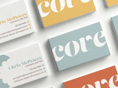
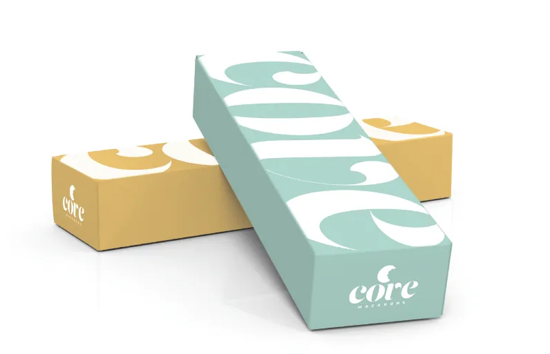
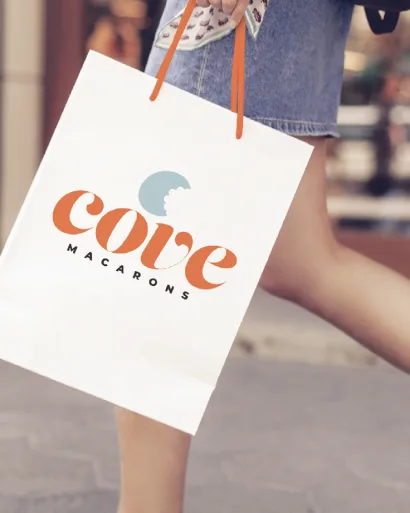
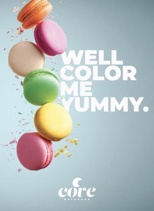
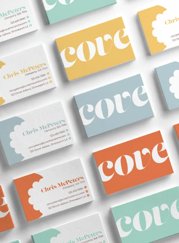
Cove Macarons
This branding project for Cove Macarons uses a bright, summery color palette and bold yet elegant typography to reflect the brand’s playful sophistication. The design aims to capture attention quickly while conveying the vibrant, high-quality nature of their handcrafted macarons.
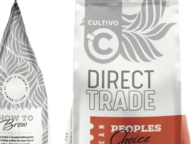
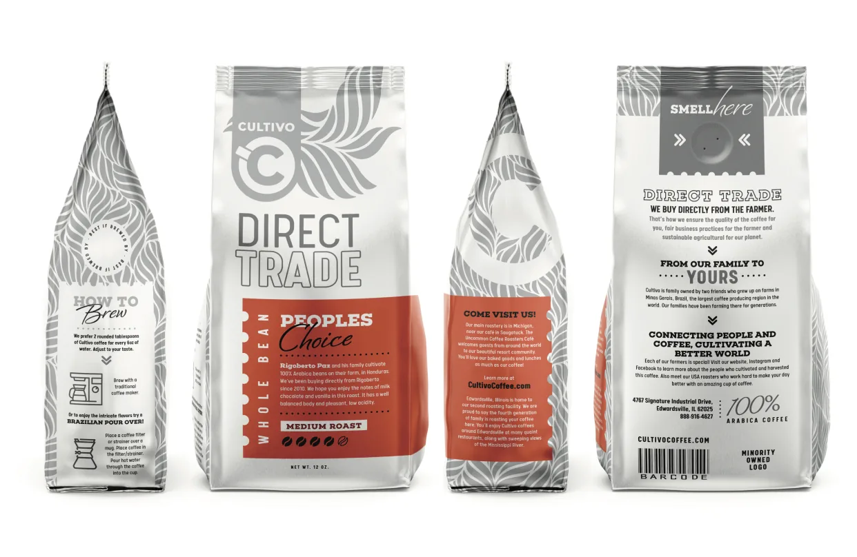
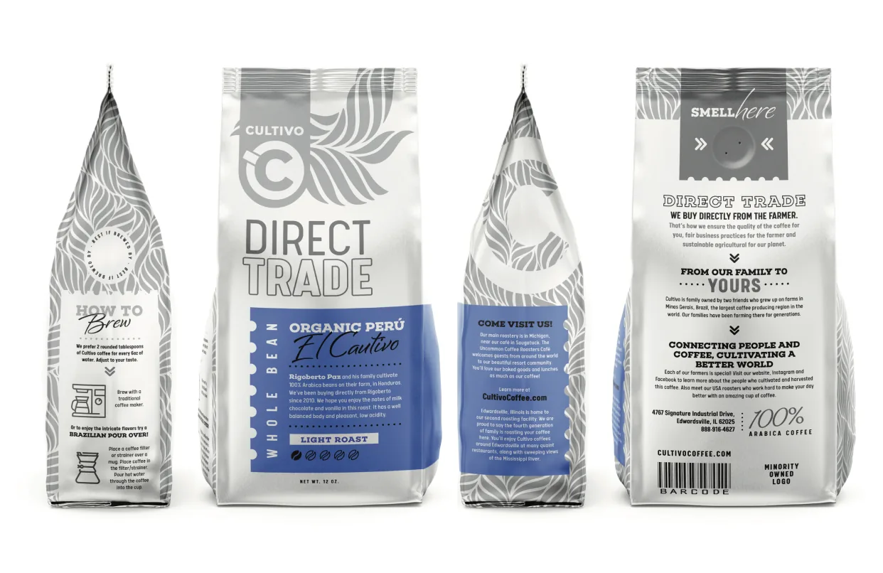
Cultivo Coffee Packaging
This packaging redesign concept for Cultivo Coffee is rooted in the company’s values of community, sustainability, and craft. A clean gray and white palette reflects simplicity, while subtle touches of color distinguish coffee types, reinforcing Cultivo’s thoughtful, quality-driven approach.
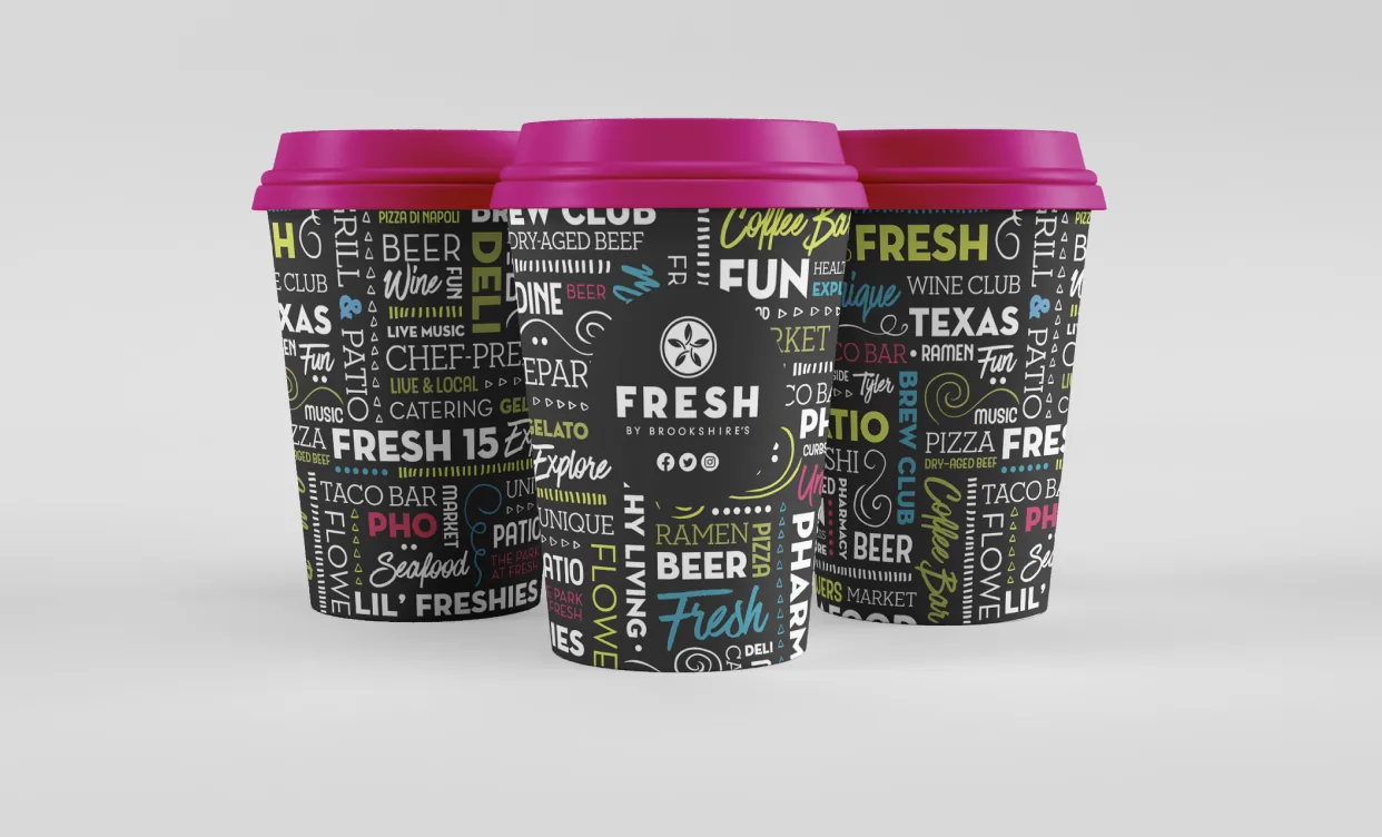
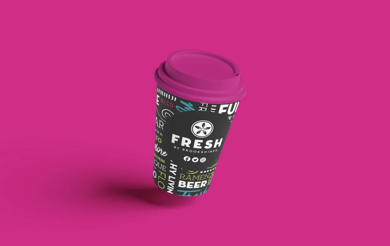
FRESH Coffee Cup
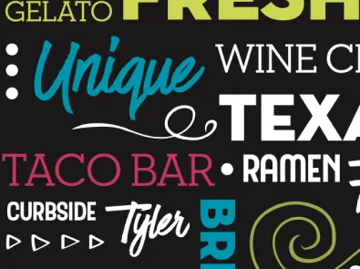
This to-go coffee cup design for FRESH by Brookshire’s uses a black base to create contrast and make the bright, bold colors pop. Handwritten-style words and playful illustrations highlight key elements of the store’s personality—freshness, quality, and a vibrant local vibe.
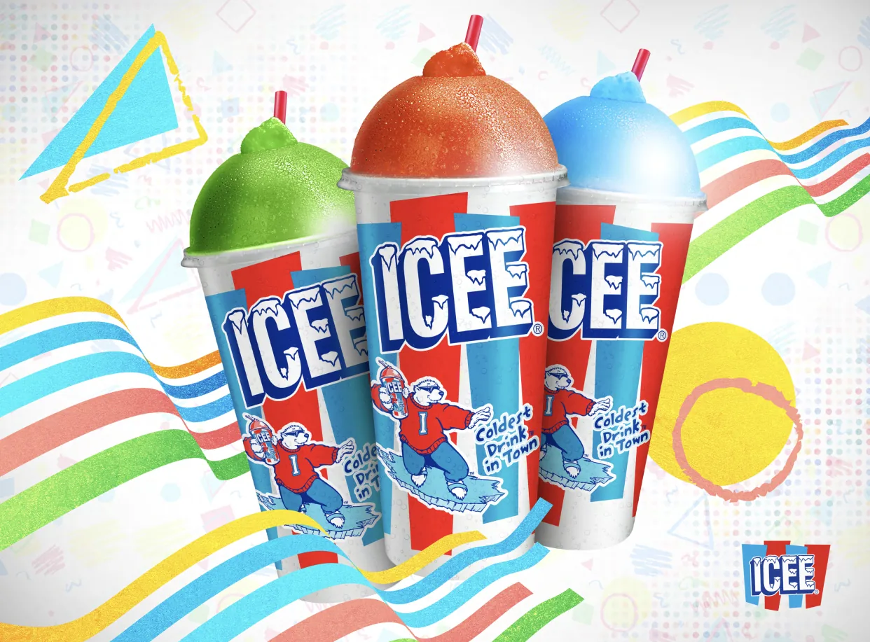
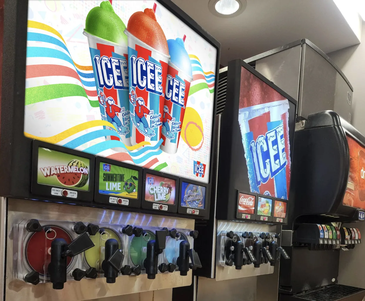
ICEE Machine Graphics
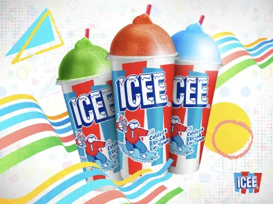
The updated artwork for the ICEE machine features bright, colorful graphics and playful textures to bring new energy to the unit. The refresh was designed to stay true to ICEE’s iconic brand while keeping the look fun, bold, and eye-catching for today’s audience.
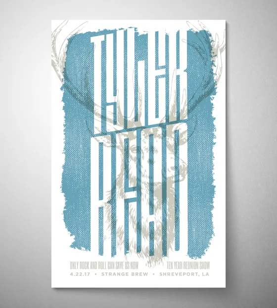
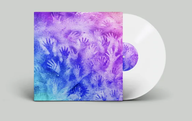
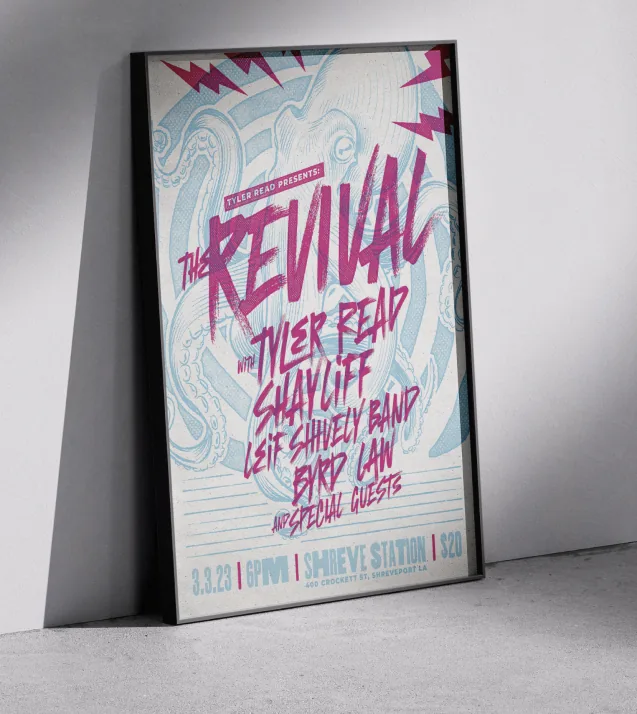
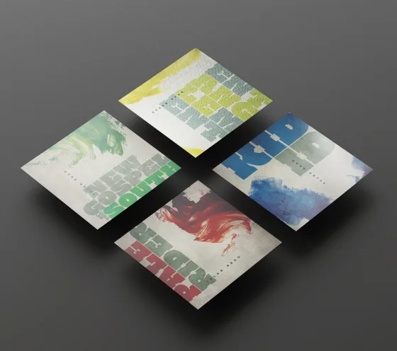
Tyler Read
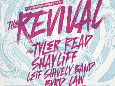
A series of merchandise pieces was created for Tyler Read, including posters and album artwork. Using bold typography and striking imagery, the aim was to reflect the band’s energetic, guitar-driven sound and nostalgic southern rock roots.
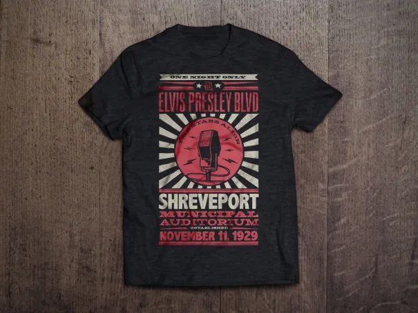
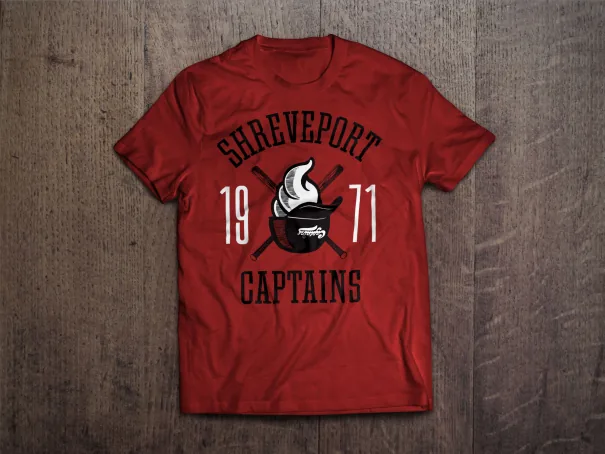
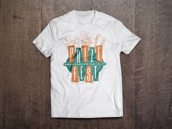
Misc. Shreveport Apparel
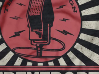
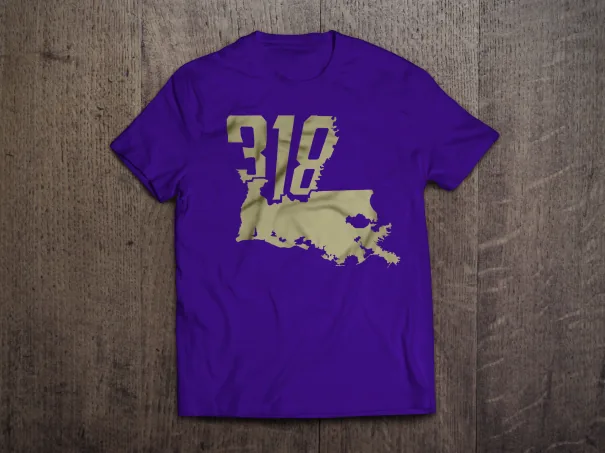
This collection of Shreveport-themed t-shirts draws from the city’s rich history and culture, using bold graphics, local references, and vintage-inspired styles. Each design celebrates a unique aspect of Shreveport’s identity, creating a sense of hometown pride and connection.
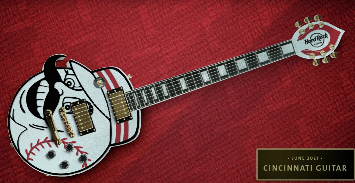
Hard Rock Cincinnati Guitar
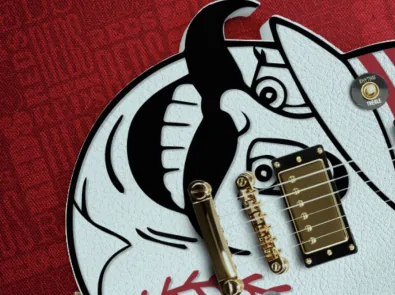
This guitar concept was created for the opening of Hard Rock Casino in Cincinnati, themed around Mr. Red, the city’s iconic MLB mascot. Working in tandem with a guitar builder in Lafayette, Louisiana, the goal was to keep the guitar fully playable while giving it a completely unique look and shape. The team colors, playful graphics, and bold detailing helped celebrate local pride and tie the casino launch to Cincinnati’s rich sports culture.
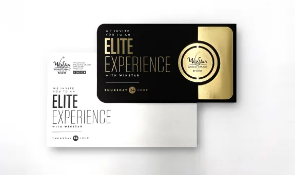
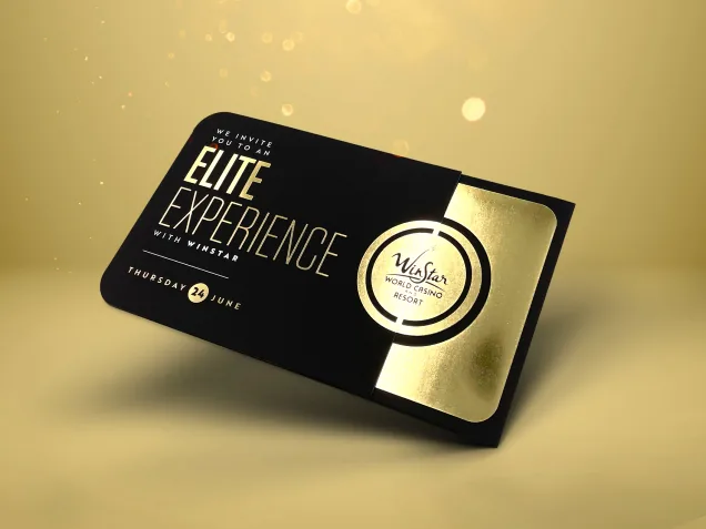
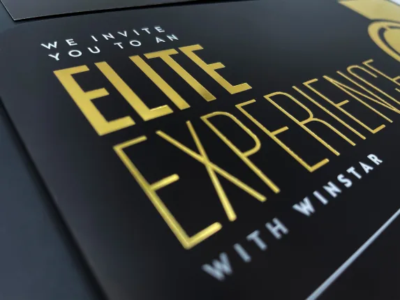
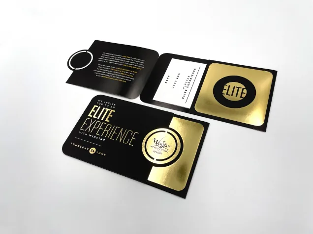
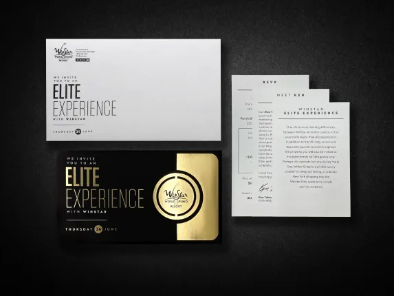
WinStar Elite Dinner Invitation
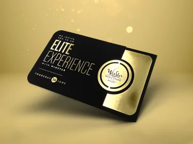
This Addy Award-winning specialty mailer for WinStar Casino VIP members was designed to reflect exclusivity and luxury. Black and gold tones, enhanced with gold foil, soft touch coating, die cuts, and vellum inserts, create a tactile and visually striking experience that reinforces the high-end status of its recipients.
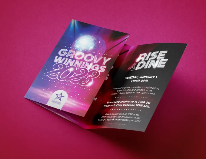
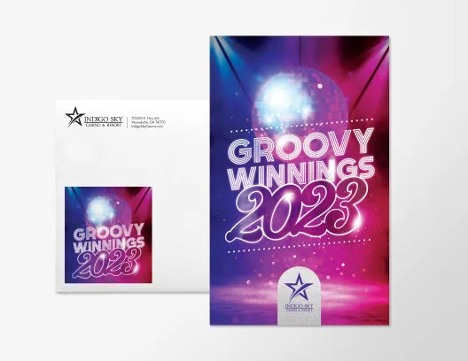
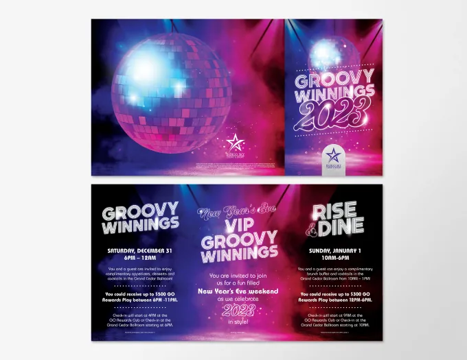
Indigo Sky NYE Invitation
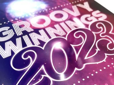
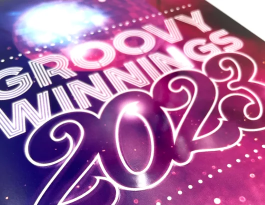
This Addy Award-winning New Year’s Eve mailer for Indigo Sky Casino invited players to a disco-themed celebration. The design features vibrant blues, purples, and pinks to capture the retro energy of the theme, while soft touch coating and raised UV details added a tactile, elevated finish to enhance excitement and engagement.
Casino Del Sol NYE Invitation
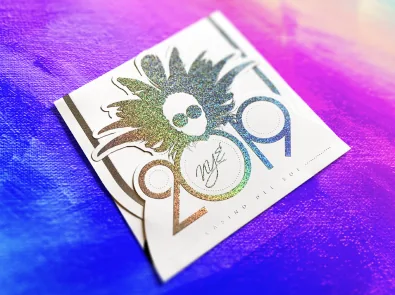
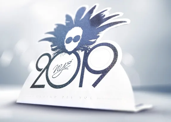
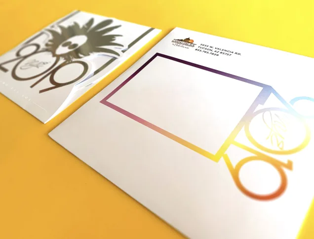
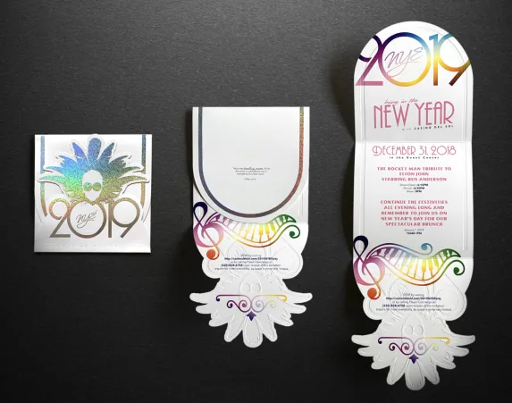
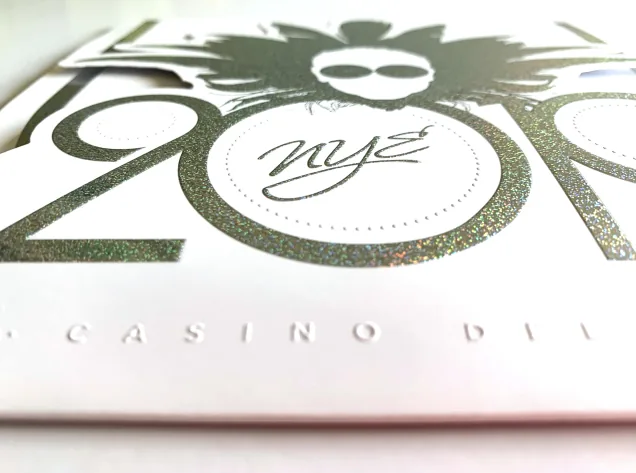
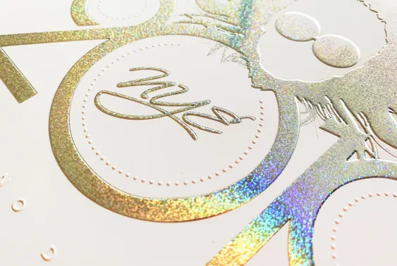
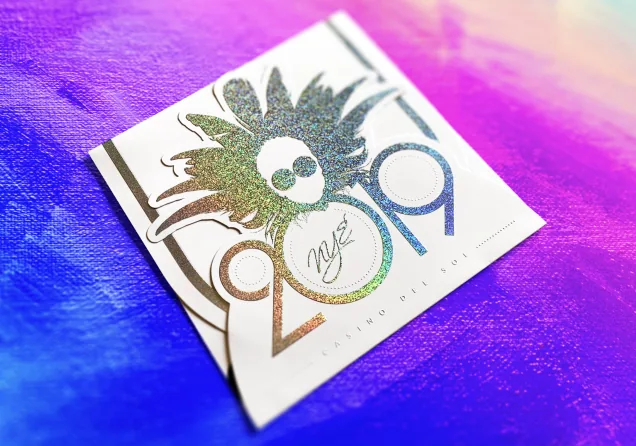
This specialty mailer for Casino Del Sol promoted a New Year’s Eve event featuring an Elton John tribute act. It used holographic foil, soft touch coating, die cuts, and embossing to create a vibrant, high-impact piece. The challenge was capturing the essence of Elton John without using his actual imagery—solved through bold color, iconic shapes, and glam-inspired details that nod to his legendary style.
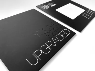
WinStar Elite Upgrade Mailer
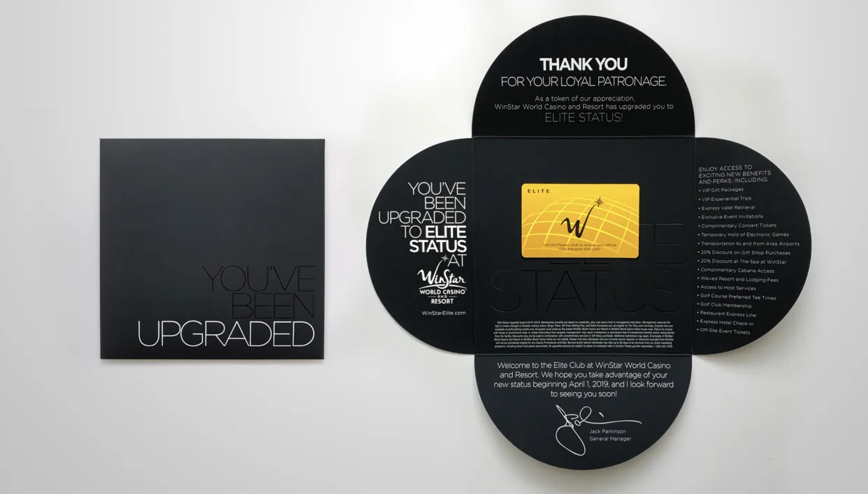
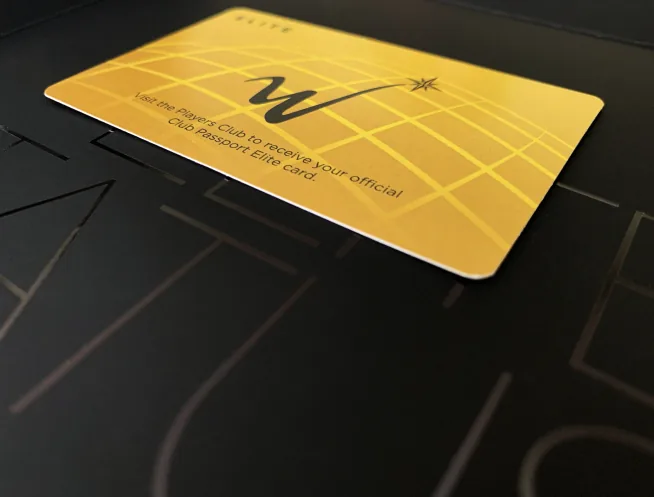
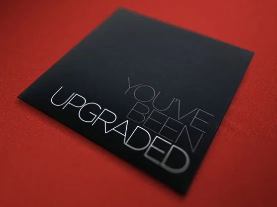
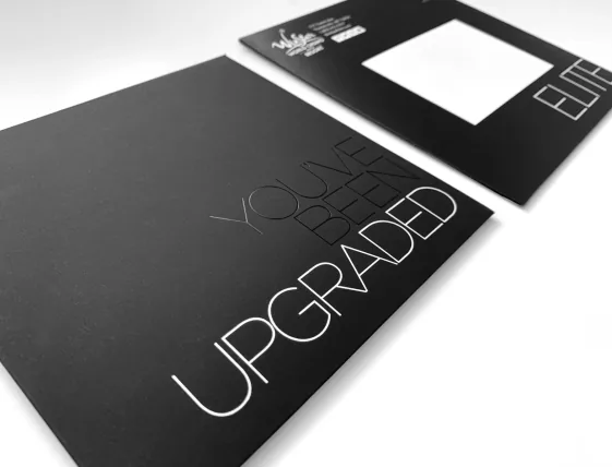
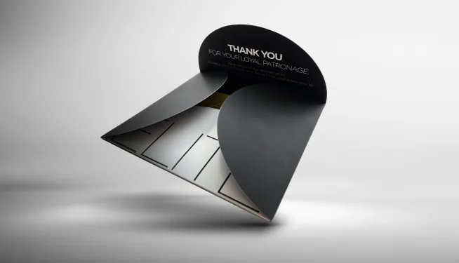
This specialty mailer announced an elite status upgrade for WinStar Casino players. Elevated with soft touch coating, intricate folds, die cuts, and black and white foils, the design aimed to create a refined, high-end feel that matched the exclusivity of the reward.
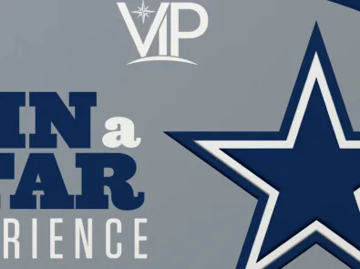
Dallas Cowboys Training Camp Invitation
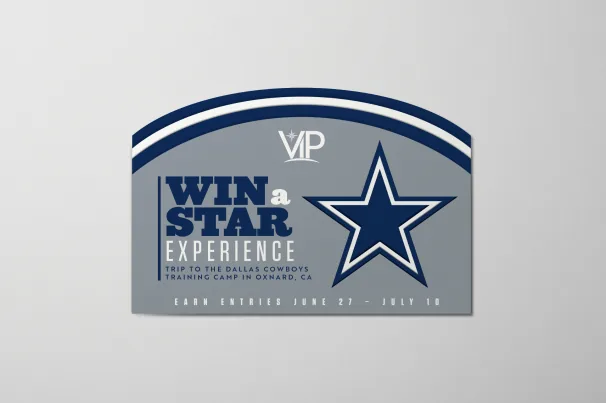
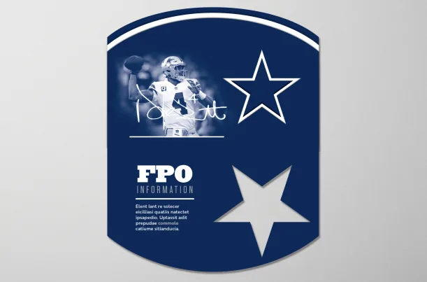
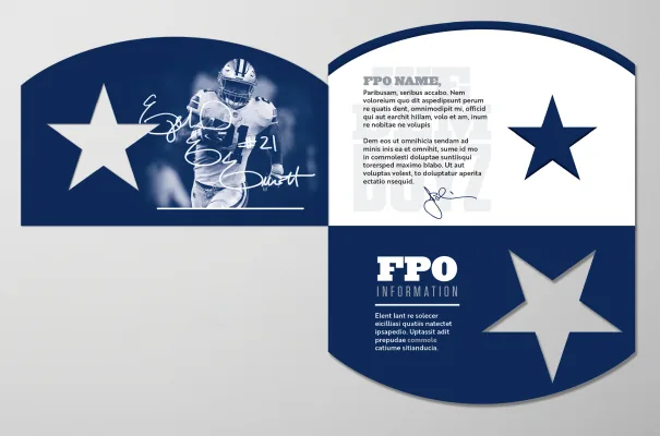
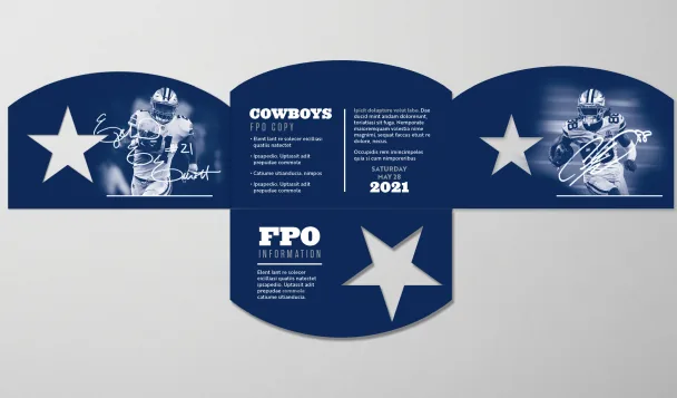
This mailer concept for an invitation to the Dallas Cowboys Training Camp in Oxnard, California, uses a rounded die cut to evoke the shape and stripes of their helmet, while intricate folds and die cuts make the iconic Cowboys star an interactive element, creating a fun, engaging experience for recipients.
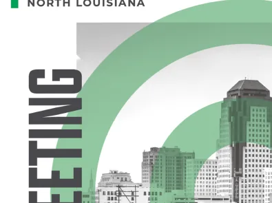
NLEP Annual Meeting Booklet
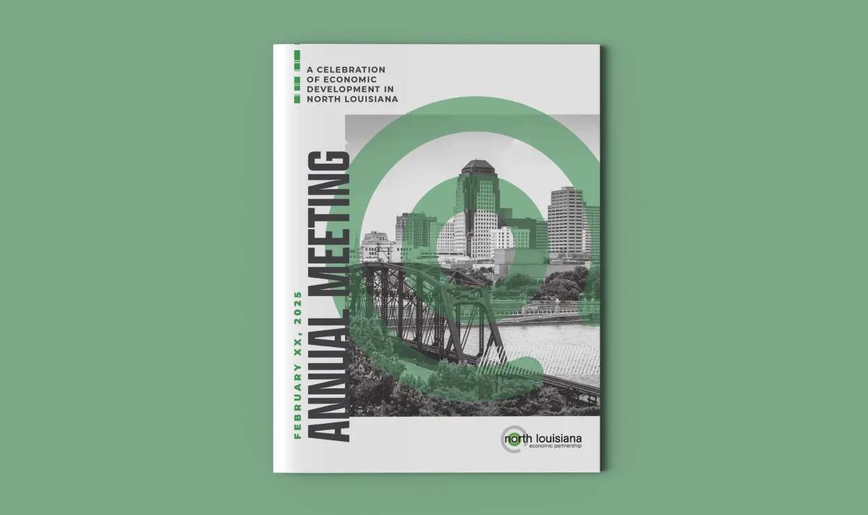
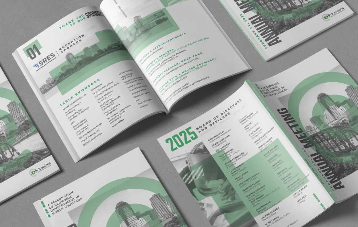
This booklet for the North Louisiana Economic Partnership annual meeting uses grayscale photography paired with varied shades of green to reflect growth, stability, and progress. The clean layout and modern palette reinforce the organization’s forward-focused mission and regional impact.
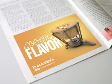
Brookshire’s Print Ad
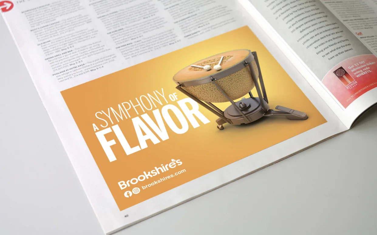
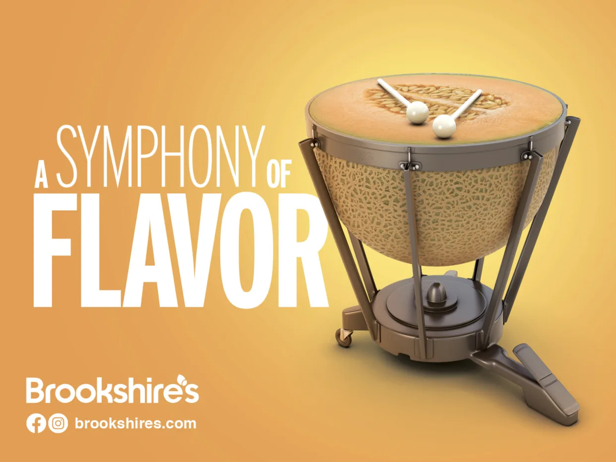
This magazine ad for Brookshire’s Grocery uses the concept “Symphony of Flavor,” combining imagery of fresh produce with musical instruments. The visual blend reinforces the idea that Brookshire’s ingredients come together in perfect harmony to create a rich, flavorful experience.
Brookshire’s Heroes Run Truck
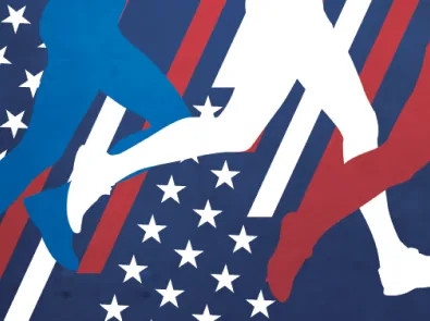
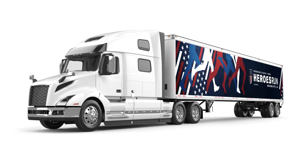
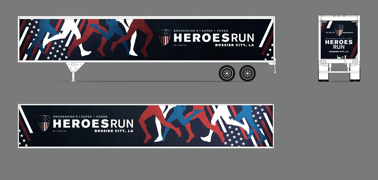
This 18-wheeler trailer design concept promotes the Brookshire’s Heroes Run, an annual race honoring military heroes and first responders. Runner silhouettes, patriotic colors, and use of patterns reflect the spirit of the event while ensuring high visibility and impact on the road.
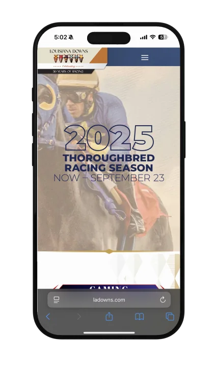
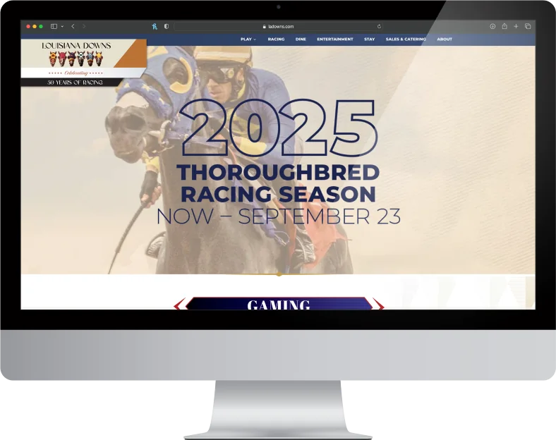
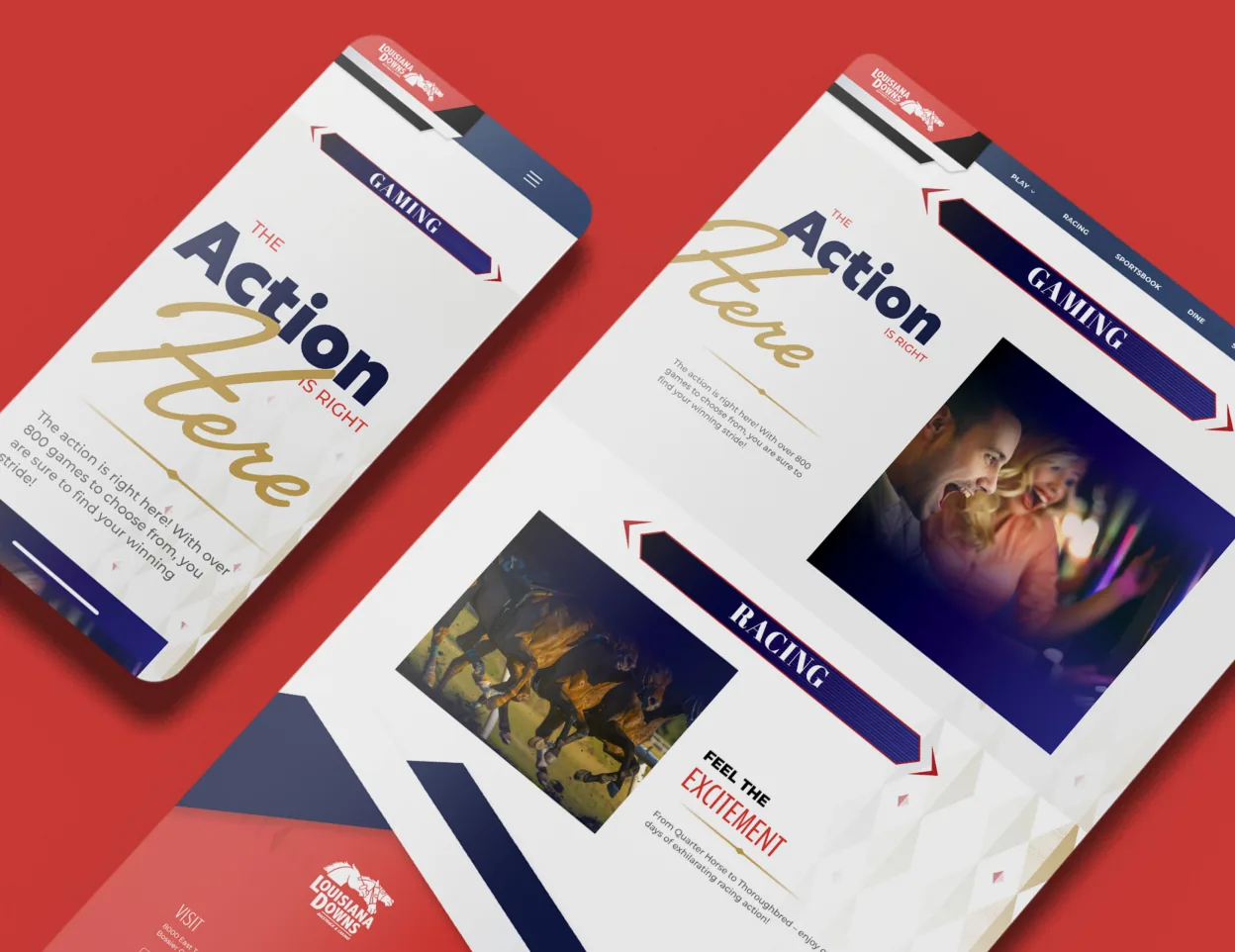
Louisiana Downs Website Design
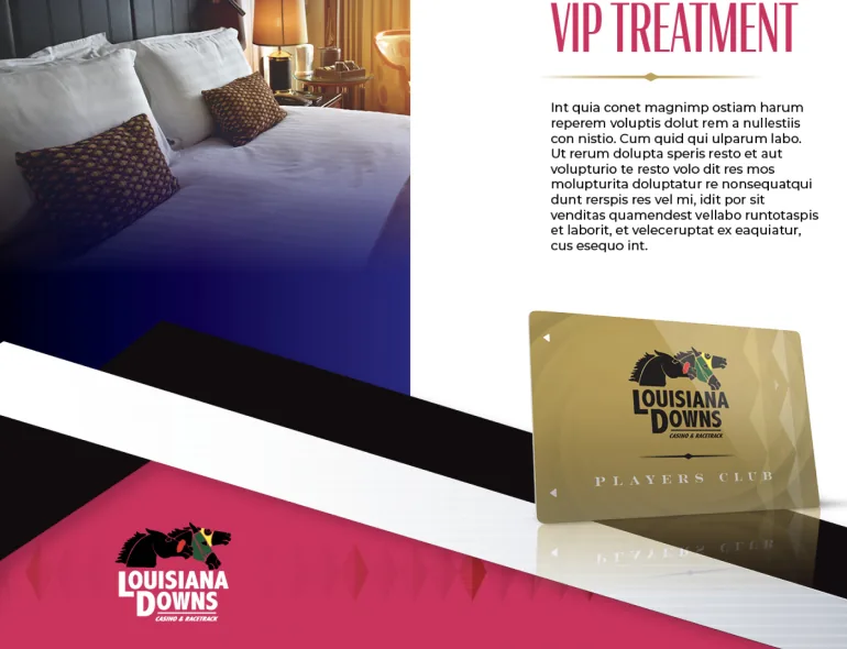
The redesigned Louisiana Downs Casino & Racetrack website features a bold, modern layout that reflects the energy of both live racing and casino gaming. A dark, dramatic color palette with gold accents conveys excitement and luxury, while large, high-impact visuals and clean typography improve readability and engagement. Streamlined navigation and mobile responsiveness ensure a seamless user experience across devices, encouraging ticket sales, event attendance, and casino visits. The new design positions Louisiana Downs as both a thrilling entertainment destination and a modern southern icon.
View the website.
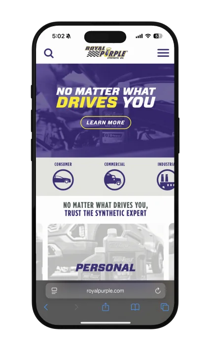
Royal Purple Website Design
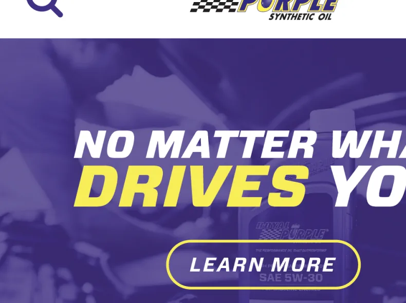
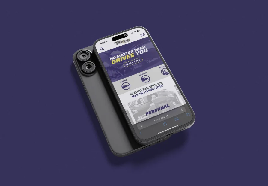
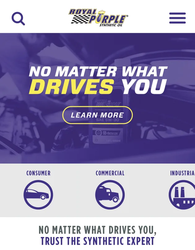
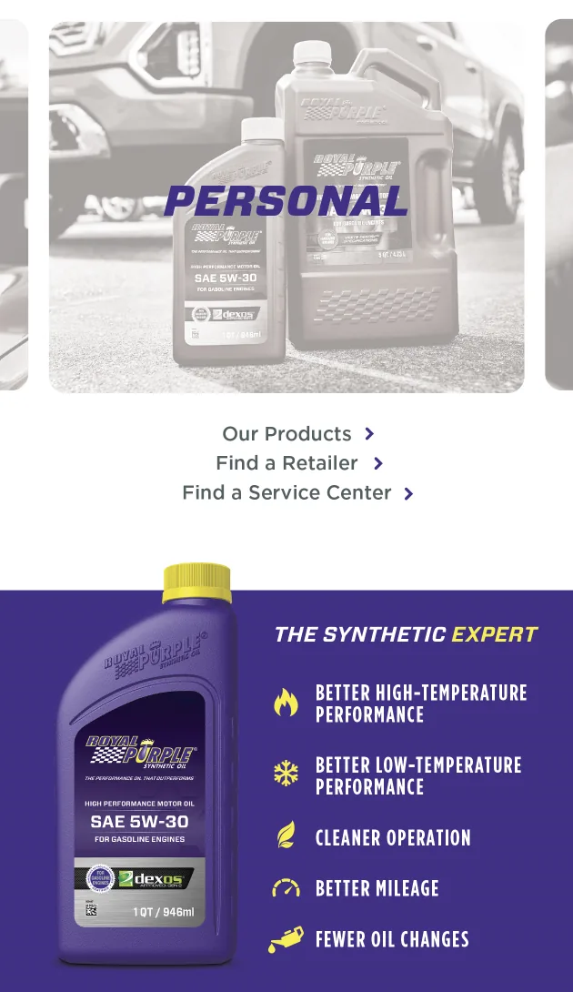
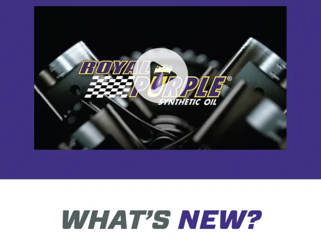
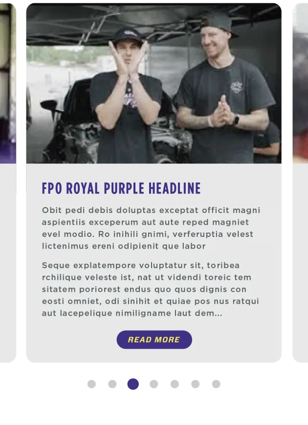
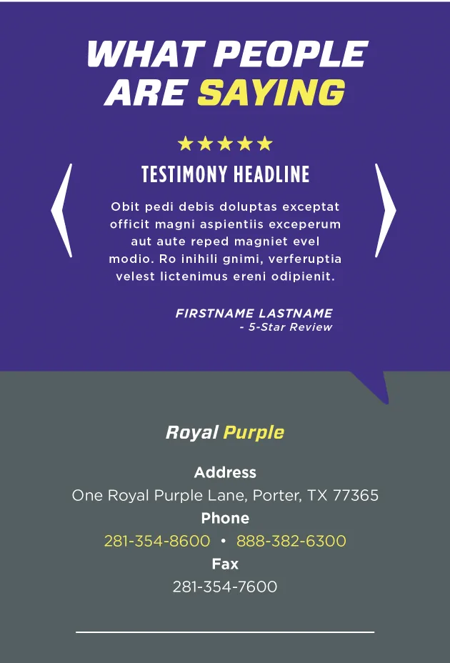
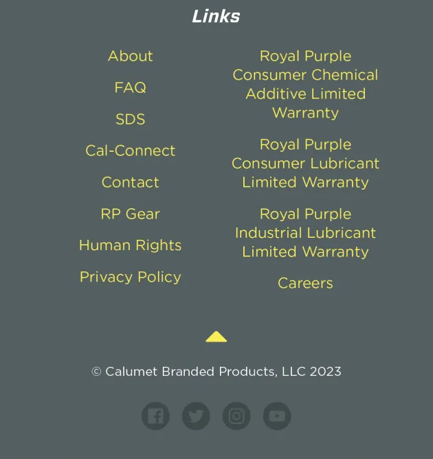
This website redesign uses Royal Purple’s signature colors, strong typography, and high-impact visuals to convey energy and performance. Clear sections, intuitive icons, and a mobile-first layout improve navigation and support the brand’s reputation as a synthetic oil leader.
Romph Pou Website Design
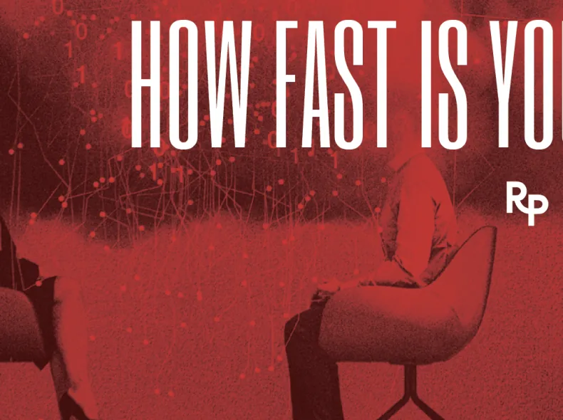
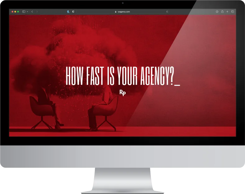
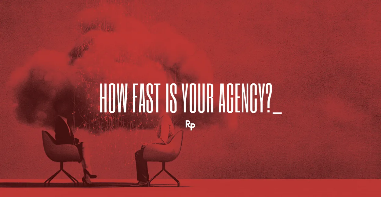
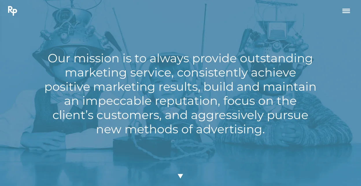
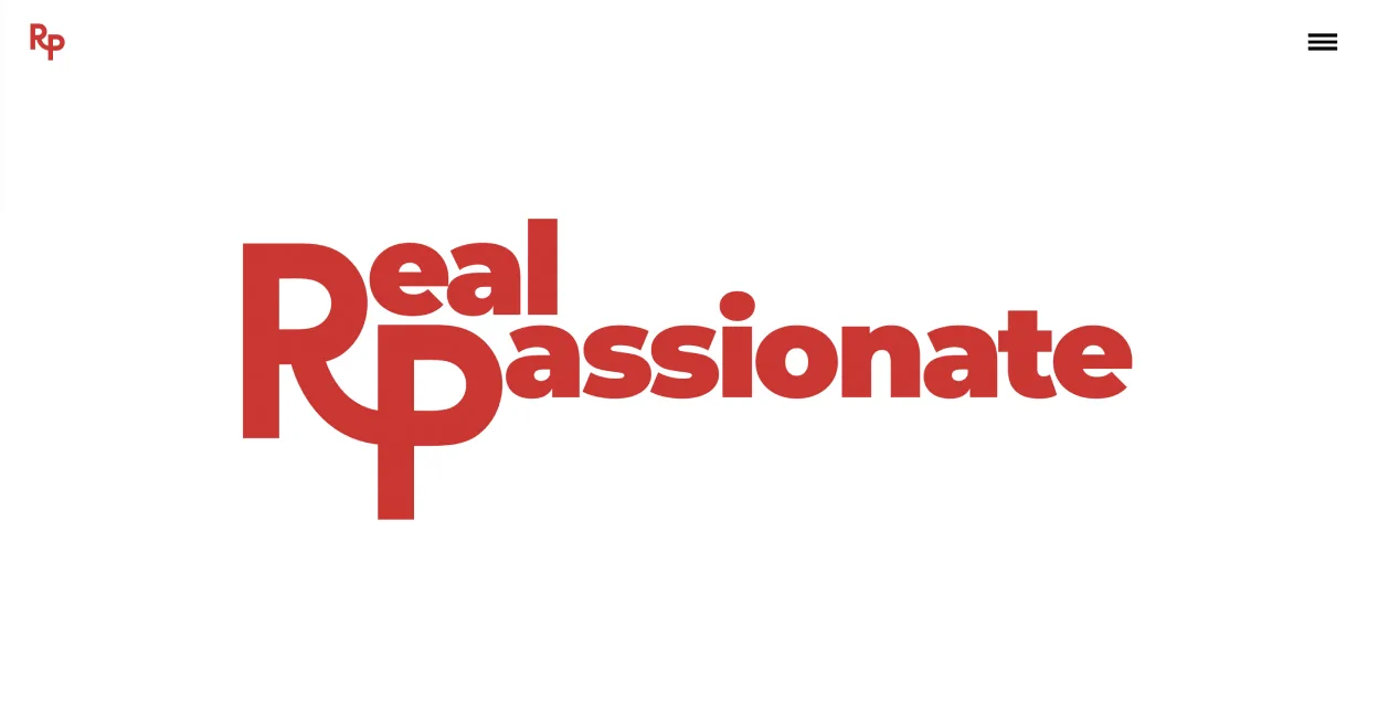
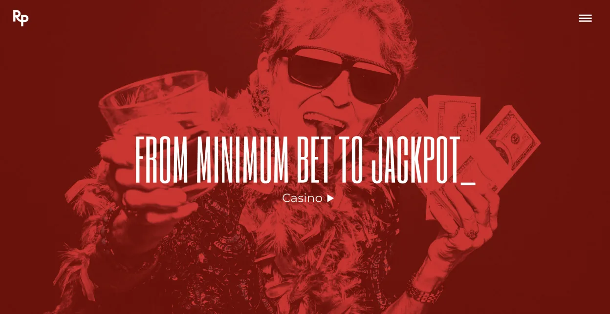
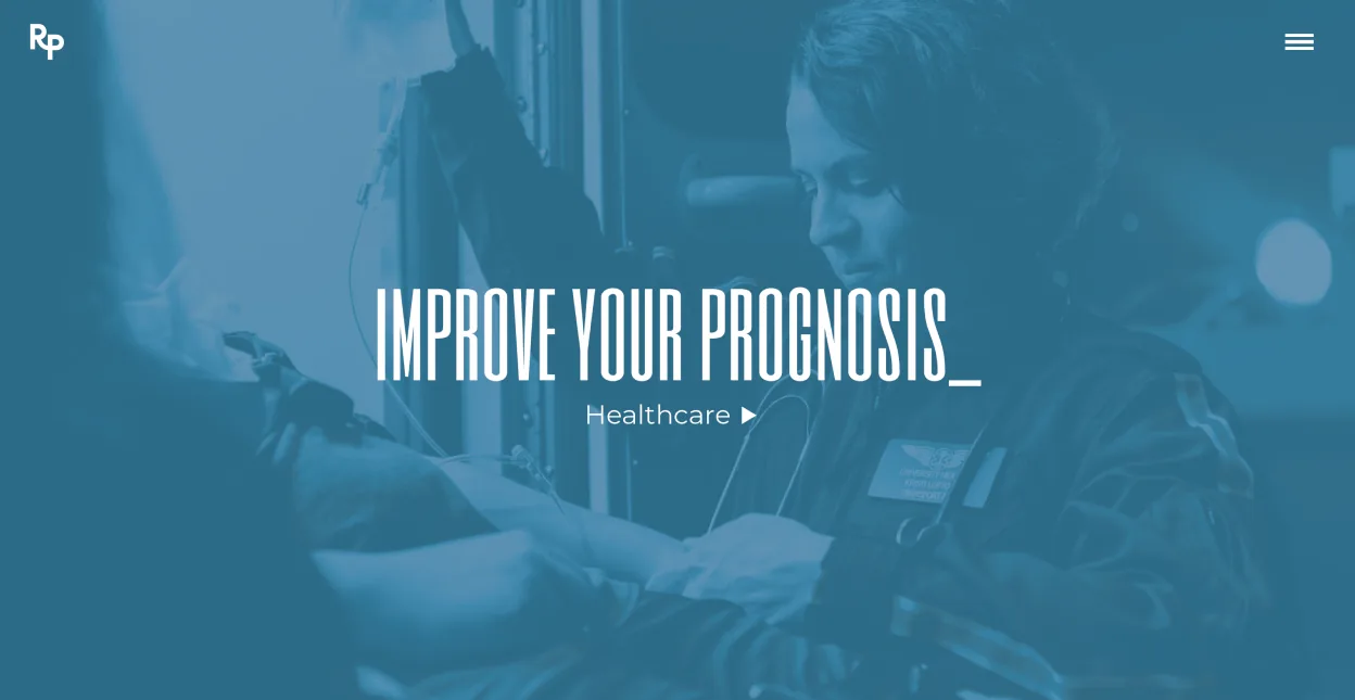
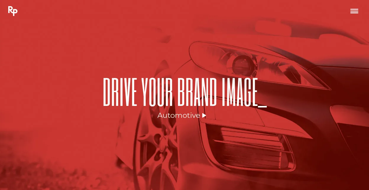
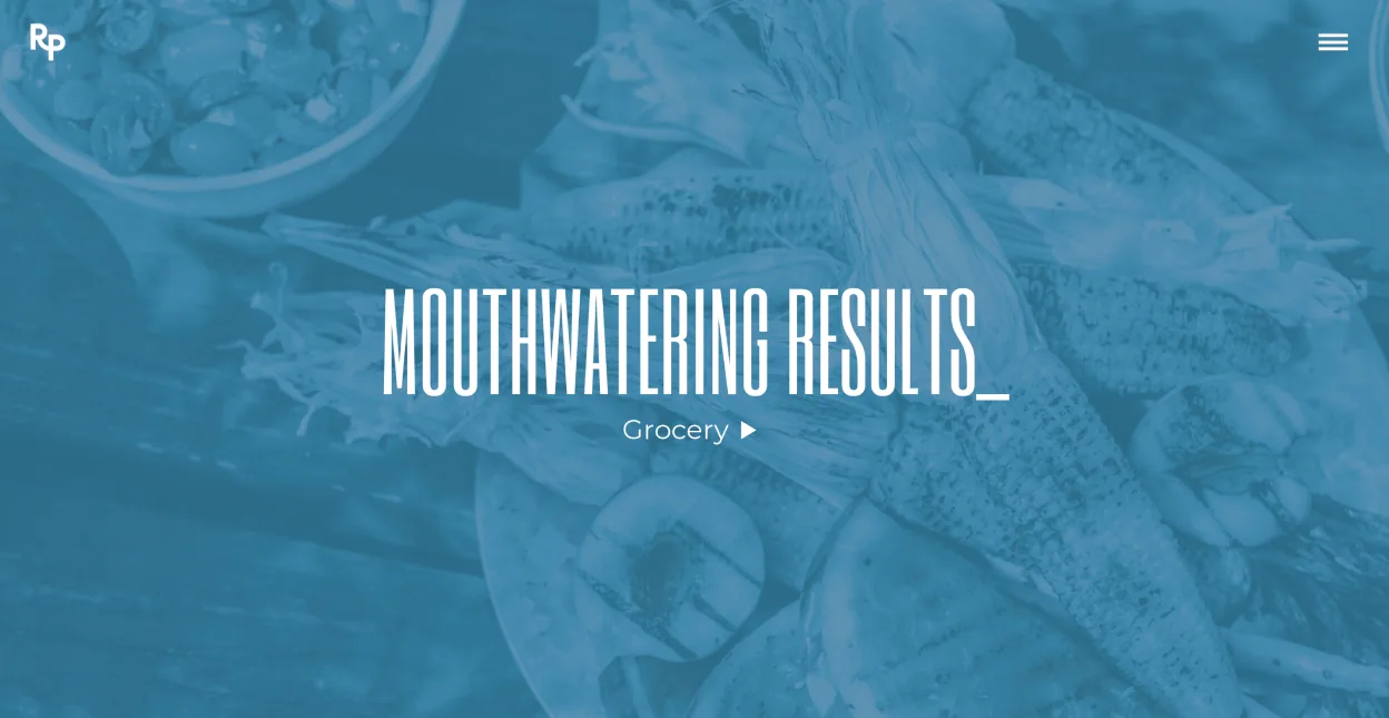
This Romph Pou website redesign concept brings a modern feel to the established Shreveport-based marketing firm. Parallax scrolling creates depth and movement as users explore the site, while a typing effect adds energy and immediacy to key messaging. Subtle animations built around the RP logo reinforce brand identity and keep the experience engaging, aligning the site’s interactivity with the agency’s creative edge.
UTT School of Medicine Website Design
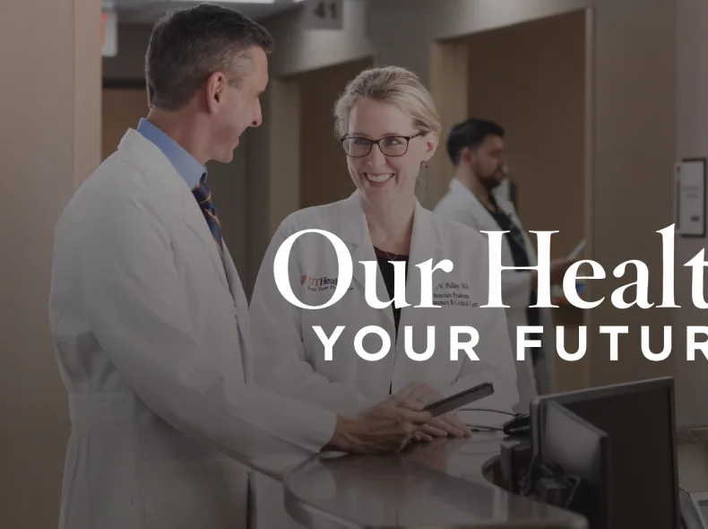
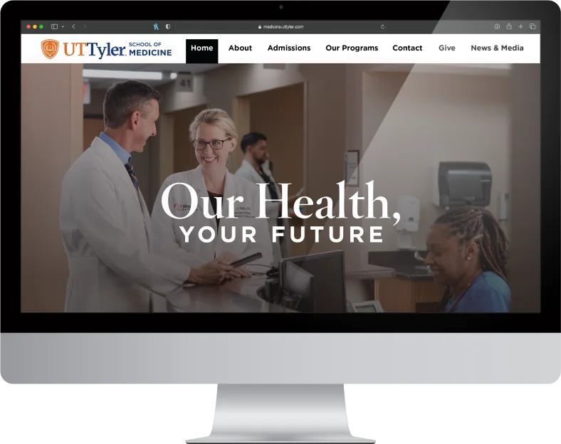
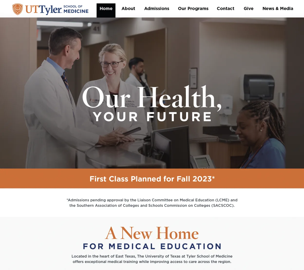
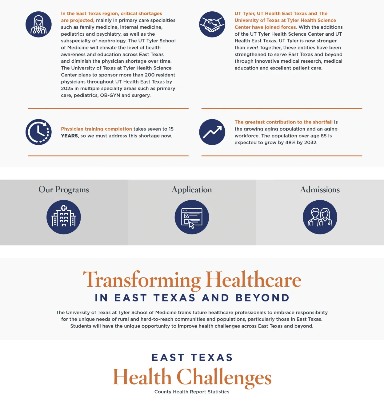
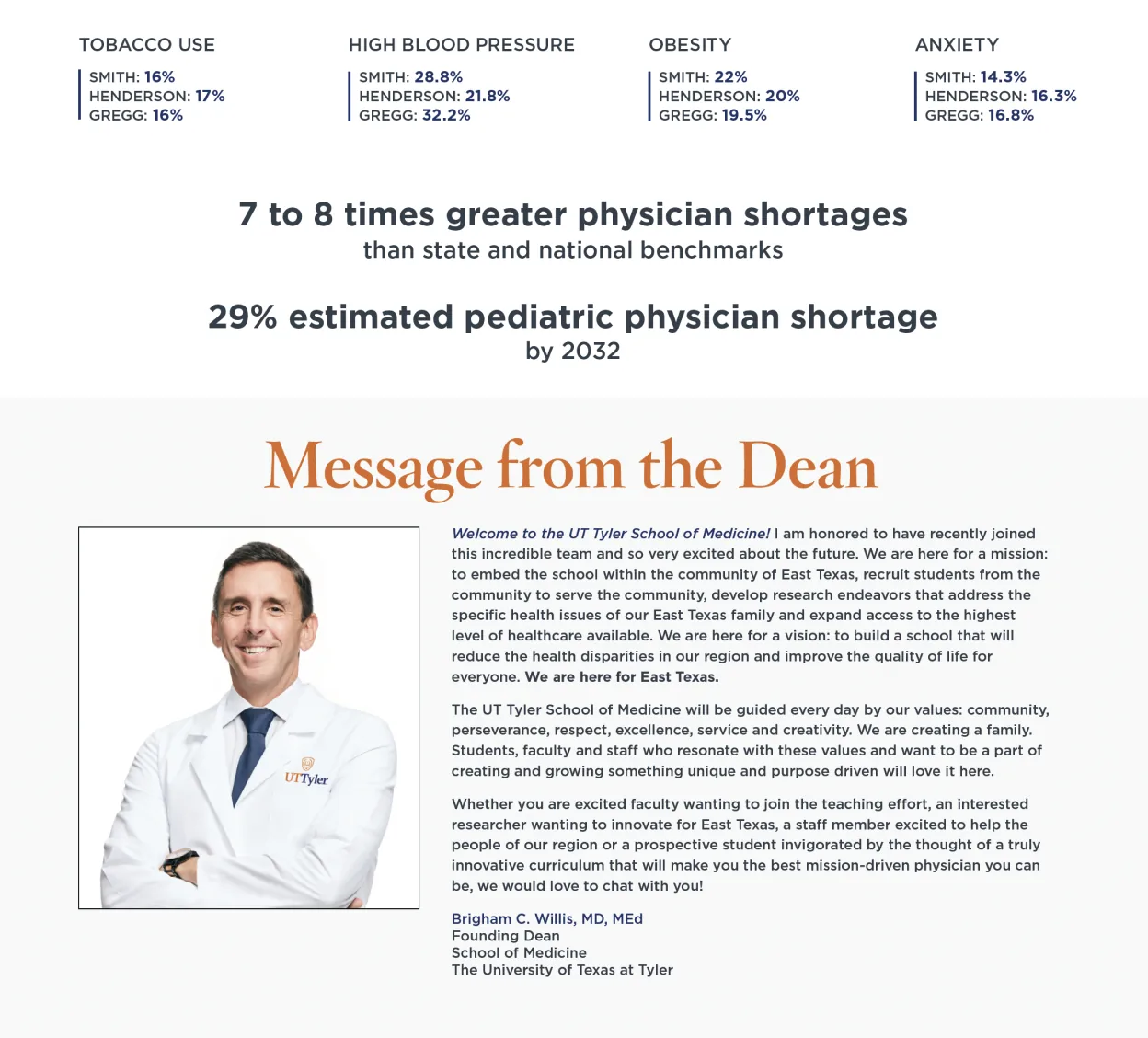
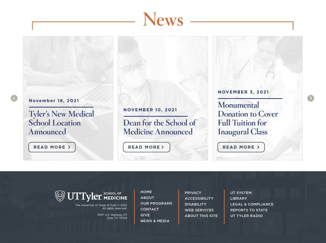
The redesigned UT Tyler School of Medicine website uses a clean, modern layout with a predominantly white and light gray color scheme to convey professionalism and clarity. Strategic use of the university’s orange and blue palette adds subtle brand recognition without overwhelming the content, supporting a user experience that feels both academic and approachable.
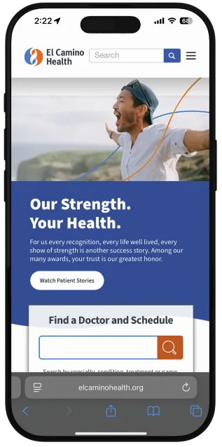
El Camino Health Website UX/UI Case Study
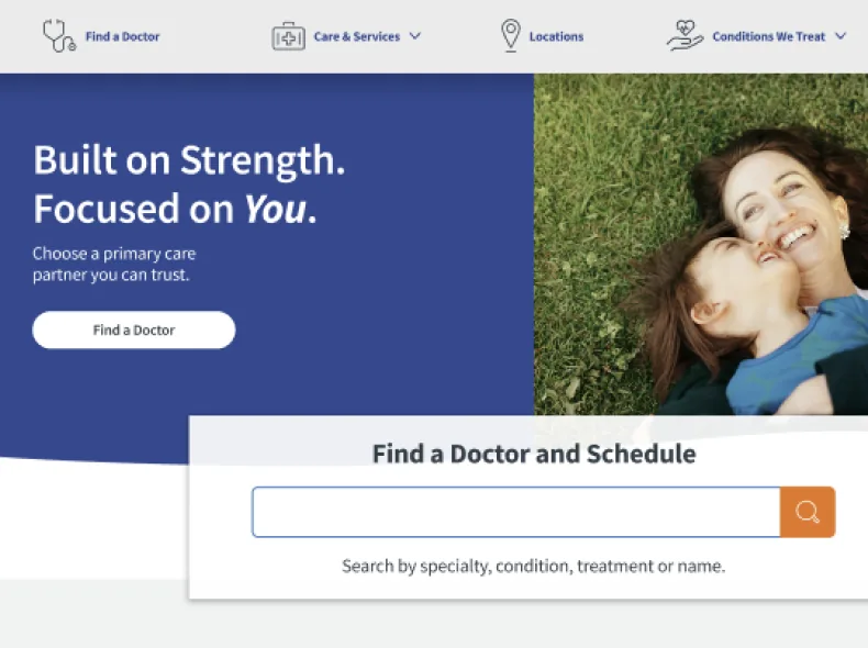
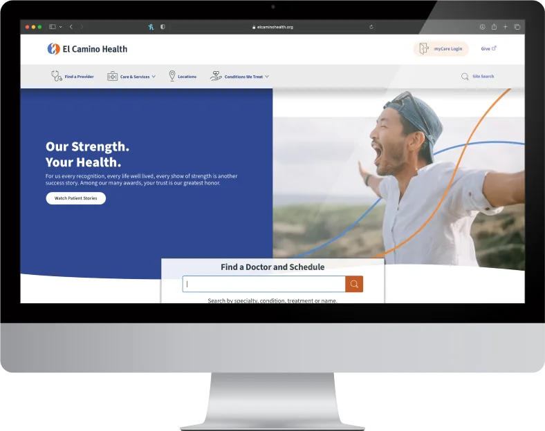
This UX/UI case study focuses on redesigning the homepage of the El Camino Health website to improve accessibility, user flow, and overall clarity. The updated design simplifies navigation for key user groups—patients, caregivers, and healthcare professionals—by prioritizing common actions like finding a doctor, scheduling appointments, and accessing health records. A clean layout, intuitive structure, and accessible color palette enhance usability across devices, ensuring a more supportive and efficient digital experience aligned with El Camino Health’s commitment to patient-centered care.
View the desktop and mobile prototype.
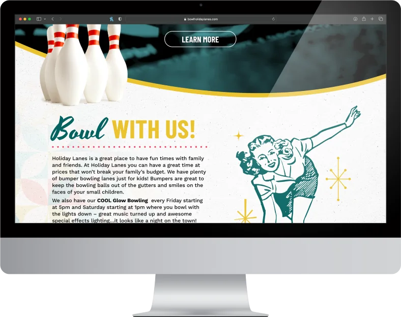
Holiday Lanes Website Design
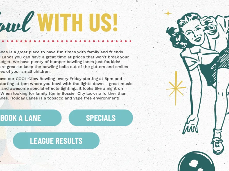
This redesign concept for the Holiday Lanes website uses a bold, bright color palette, halftones, and retro vintage illustrations to capture the nostalgic fun of classic American bowling alleys. The visual style pays homage to mid-century design while energizing the brand with a modern twist, creating an engaging and playful experience that reflects the personality of North Louisiana’s favorite family-friendly bowling destination.
View the desktop prototype.
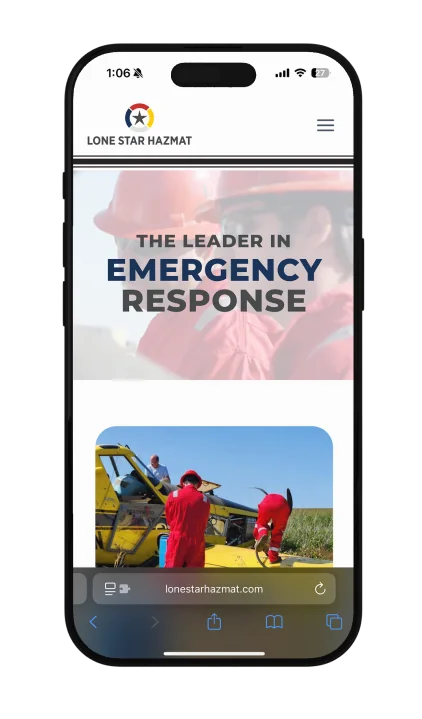
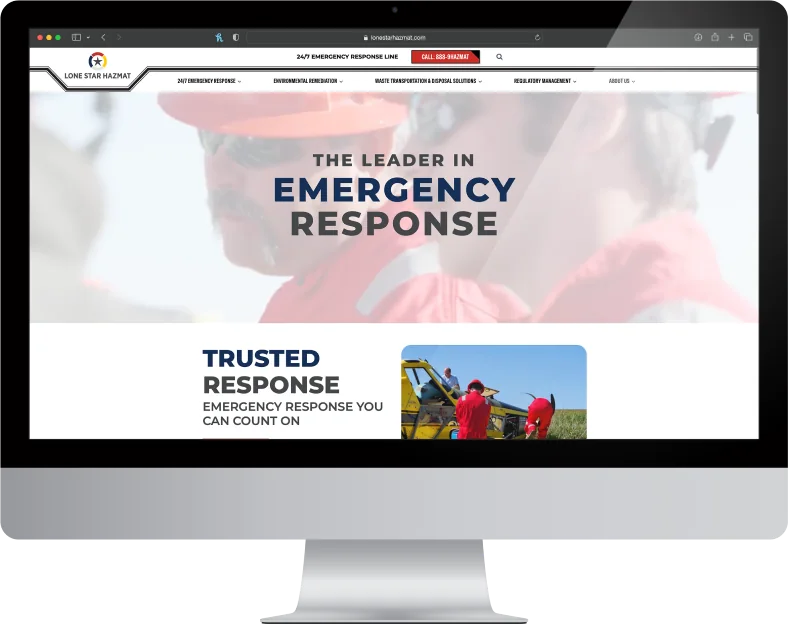
Lone Star Hazmat Website
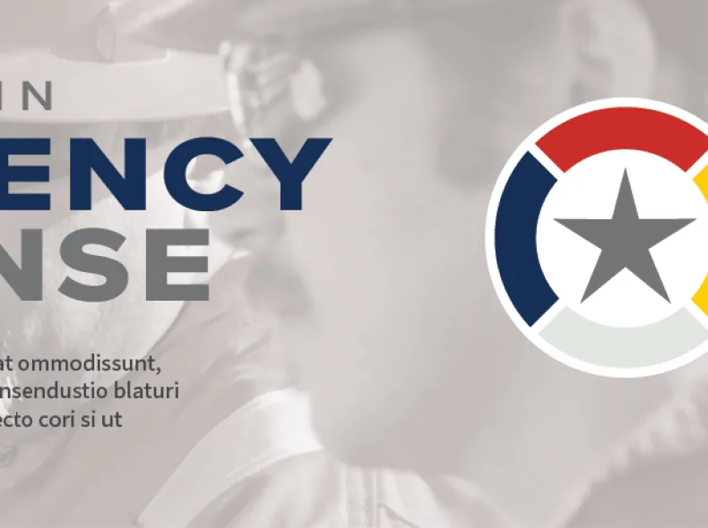
In this website overhaul, the client was looking for a clean, modern layout with strong typography and high-contrast colors to convey urgency and professionalism. Clear navigation, impactful icons, and responsive design enhance usability and reflect the company’s rapid response capabilities.
View the website.
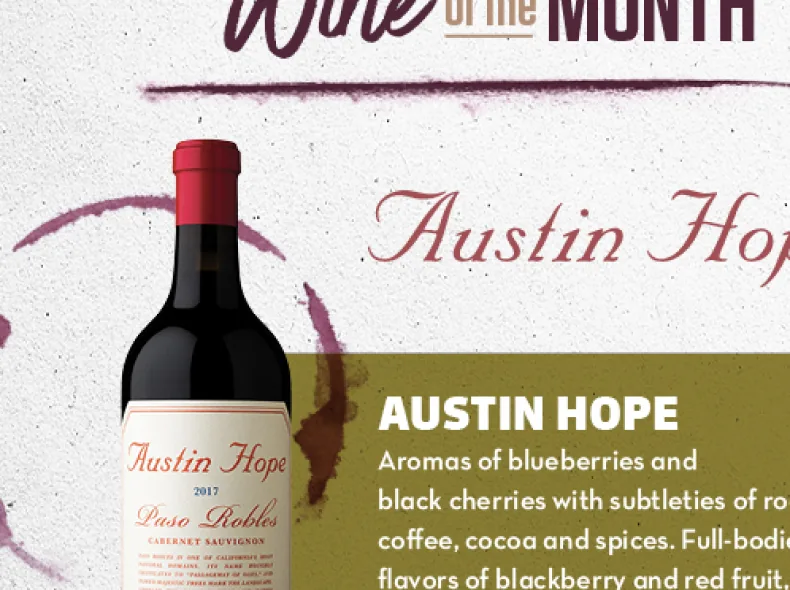
FRESH Wine Club Eblast
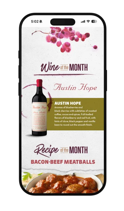
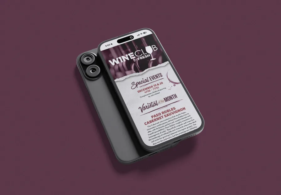
This monthly eblast design pairs dynamic wine photography with parchment textures and soft watercolor accents. A rich burgundy and olive palette evokes warmth and sophistication, creating an inviting, artisanal feel that reflects the FRESH by Brookshire’s wine club experience.

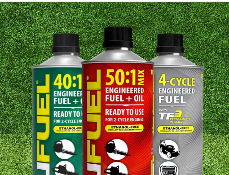
TruFuel Carousel Ad
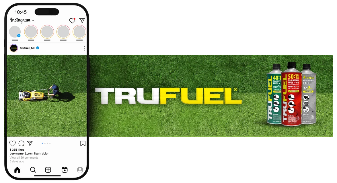
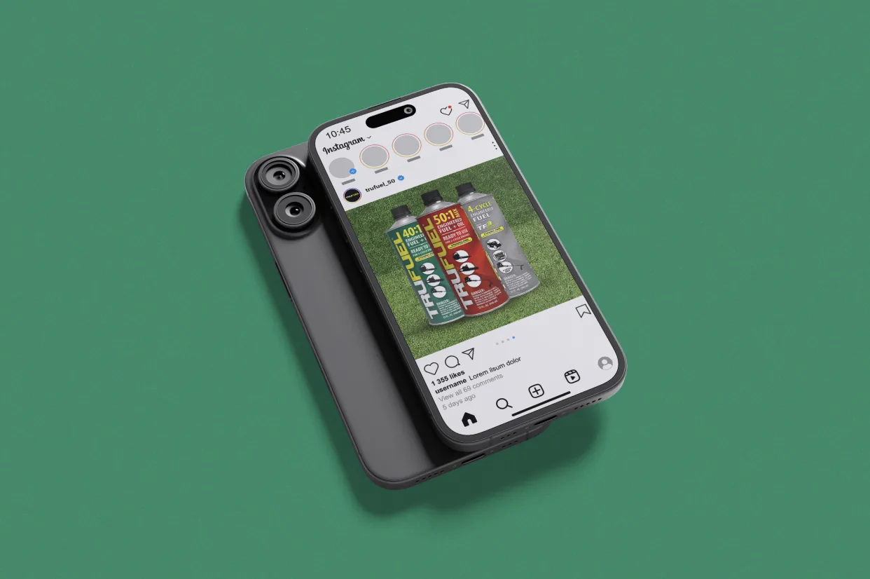
This social media carousel ad for TruFuel uses clean, straightforward visuals to highlight product relevance and brand recognition. The overhead shot of a man mowing his lawn instantly connects with the target audience, while the inclusion of TruFuel cans and logo reinforces brand identity and product utility in a clear, impactful way.
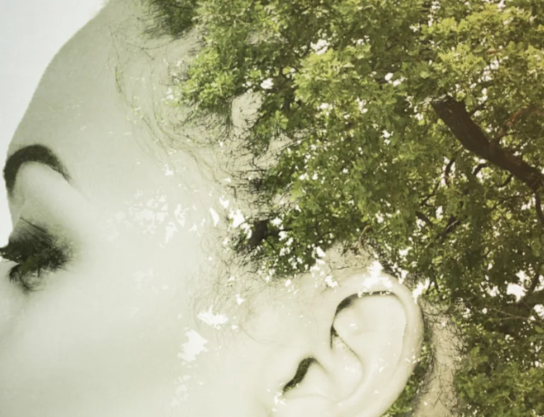
Personal Work: Photoshop Composite
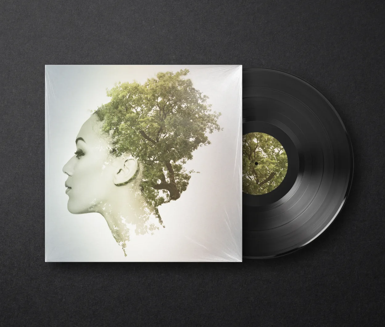
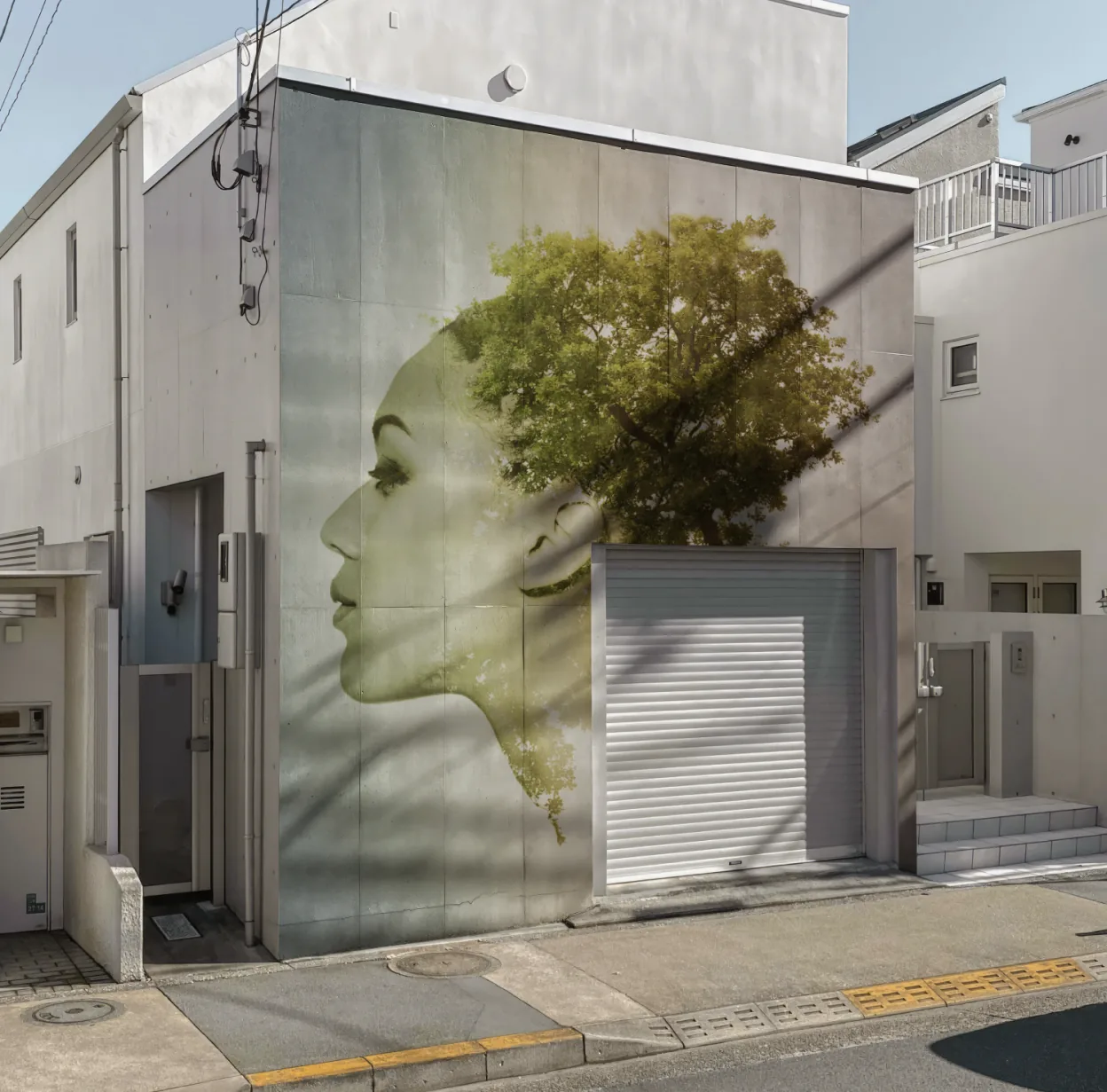
This personal artwork was created using Photoshop to achieve a double exposure effect. A profile photo of a woman is blended with nature imagery, using layer masks and blending modes to transition the human form into a natural landscape. The focus was on technique, texture, and visual balance.